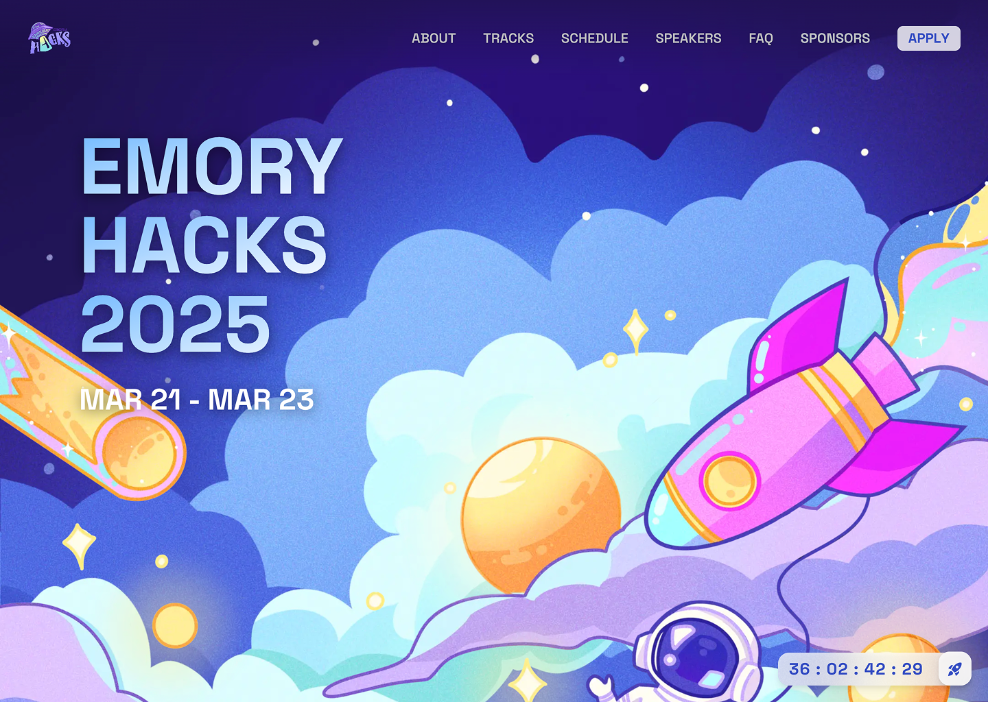
I co-founded Emory University's first software hackathon, bringing together students from multiple disciplines to collaborate, innovate, and compete. The event was a resounding success, attracting over 100 participants and securing sponsorships from industry leaders such as JPMorgan, Hyundai, and WolframAlpha.
As the Tech Lead, I spearheaded the development of the event website, ensuring a seamless user experience while collaborating closely with the graphic design team to create visually compelling elements that aligned with our theme.
Layout and Graphics
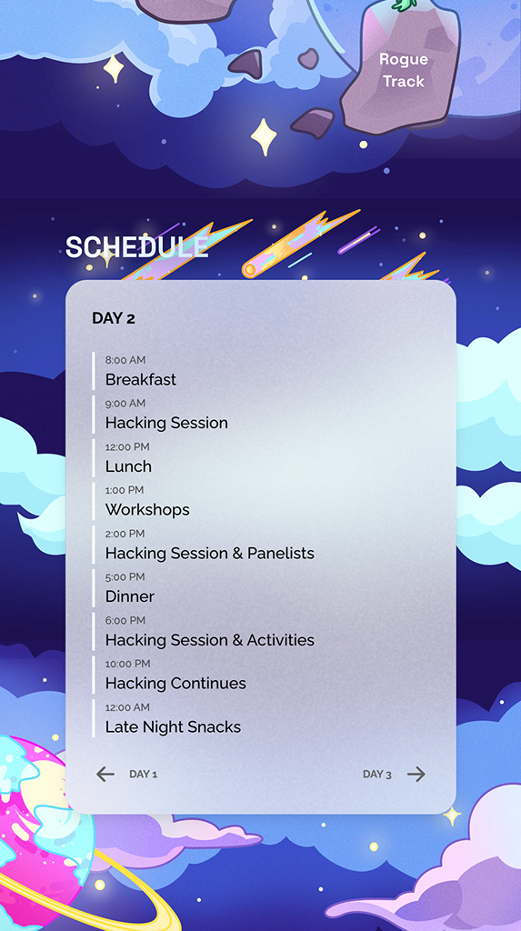
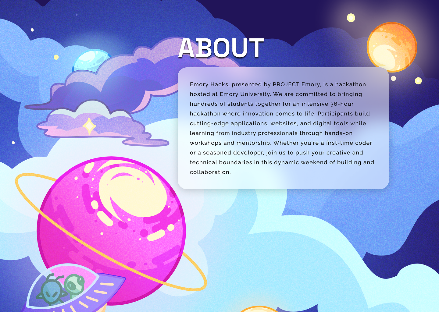
To conform to MLH (Major League Hacking) standards, our website required 6 key sections: about, tracks, schedule, speakers, FAQ, and sponsors. We envisioned a space-themed website with seamless transitions, interactive animations, and engaging visuals to captivate visitors from the moment they landed on the page.
Animations
Immersive Landing Animation
To create an engaging first impression, we designed a rocket ship animation featuring an astronaut floating in space. Using GSAP, we animated the rocket to move smoothly across the screen, creating a sense of depth and motion.
Parallax Effect
To enhance the space experience, we implemented a parallax effect, where background elements—such as clouds and planets—move at different speeds. This effect added depth and fluidity to the website’s transitions.
Floating Elements
Using Framer Motion, we introduced floating animations to various UI components, reinforcing the zero-gravity theme. This created a dynamic and immersive browsing experience.
Microinteractions
To refine the user experience, we incorporated microinteractions for buttons and navigation links. These subtle effects added polish and responsiveness, making interactions feel intuitive and visually appealing.
Responsiveness
Ensuring accessibility across all devices, we utilized Tailwind CSS media queries to create a responsive layout adaptable to desktops, tablets, and mobile screens. Some graphic elements were adjusted for smaller screens to maintain readability and usability while preserving the design’s integrity.